
Urban Coffee.
A premium coffee shop website design concept for a modern specialty cafe. Built to create a warm brand experience, make online ordering effortless, and encourage table reservations.
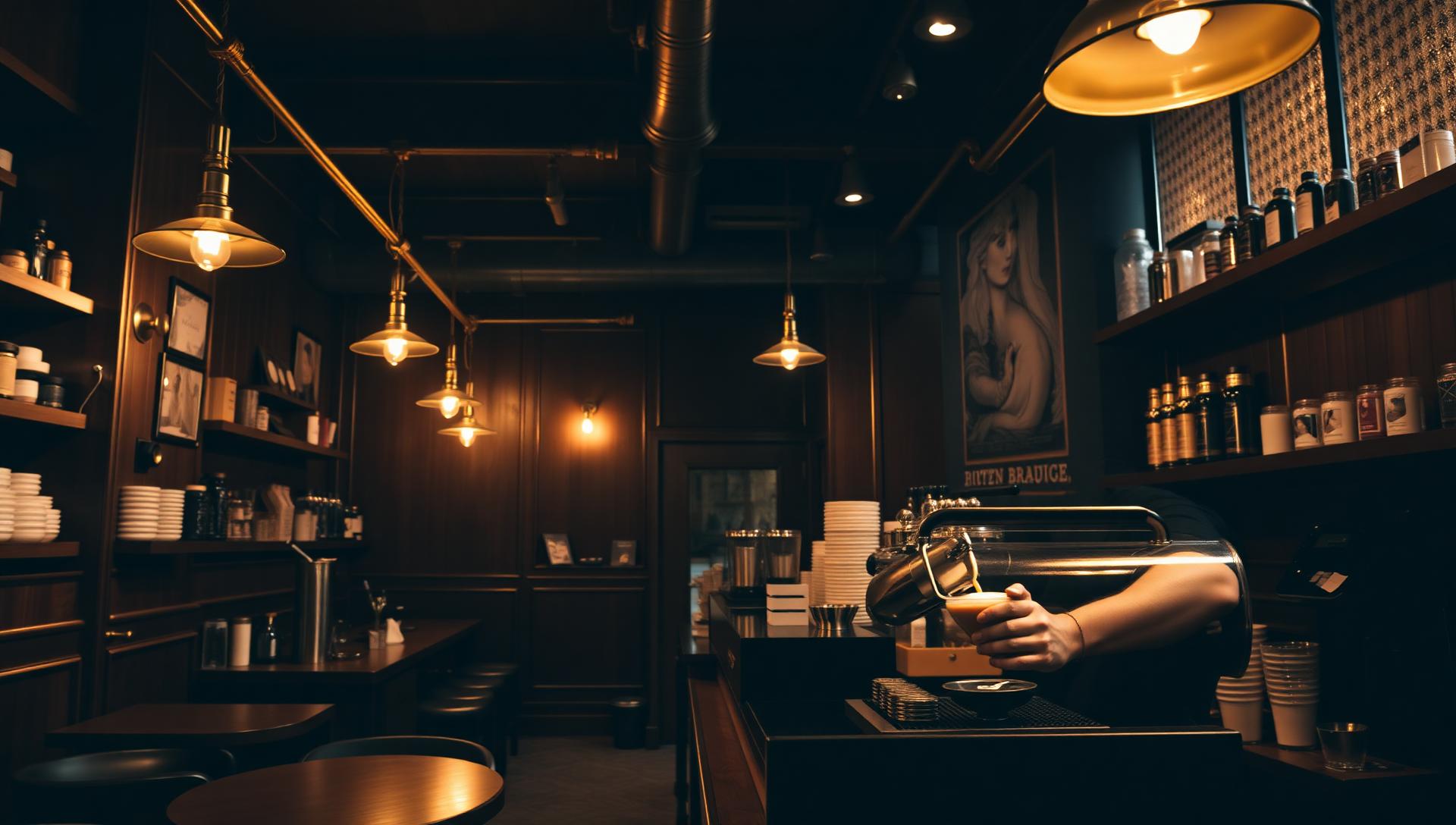
A neighborhood cafe, reimagined online.
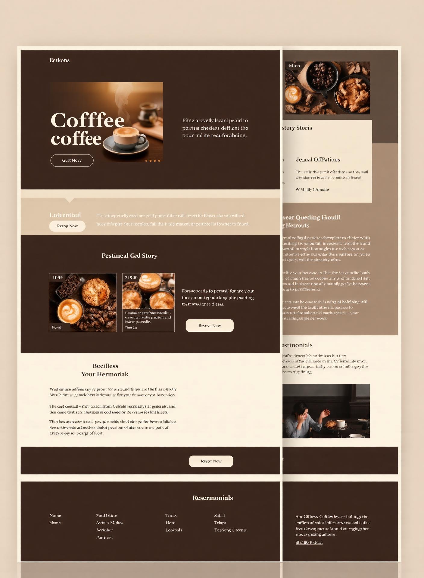
This concept explores how a neighborhood cafe can present itself online through a single landing page. Story, menu, reservations and online orders are woven into one warm, editorial scroll.
- Brand
- Urban Coffee
- Industry
- Hospitality
- Type
- Concept Project
- Services
- Web Design · UI/UX · Responsive · Landing Page
- Deliverables
- Full landing page concept
Warmth that converts.
The concept asks how a neighborhood cafe can feel as warm online as it does in person, while performing with the clarity of a modern hospitality brand.
- Create a warm, premium brand experience online
- Drive online coffee & pastry orders
- Encourage table reservations from mobile visitors
- Showcase the story, roast, and space in one scroll
Designed to make people crave the place.
A coffee shop competes on atmosphere long before anyone tastes the coffee. The UX approach was to translate the room — the light, the smell, the ritual — into a single scroll, then keep ordering and reserving one tap away at every point in it.
Appetite first, action second
Cinematic hero and food photography set the mood, and the order and reserve buttons stay visible so the impulse never has anywhere to go.
Two clear actions, no more
Order Online and Reserve a Table are the only primary actions, which stops visitors having to work out what the site wants from them.
Menu as the main content
Pricing, sizes and roast notes are structured and scannable rather than hidden in a PDF, which is where most cafe sites lose people.
Built for a phone in a queue
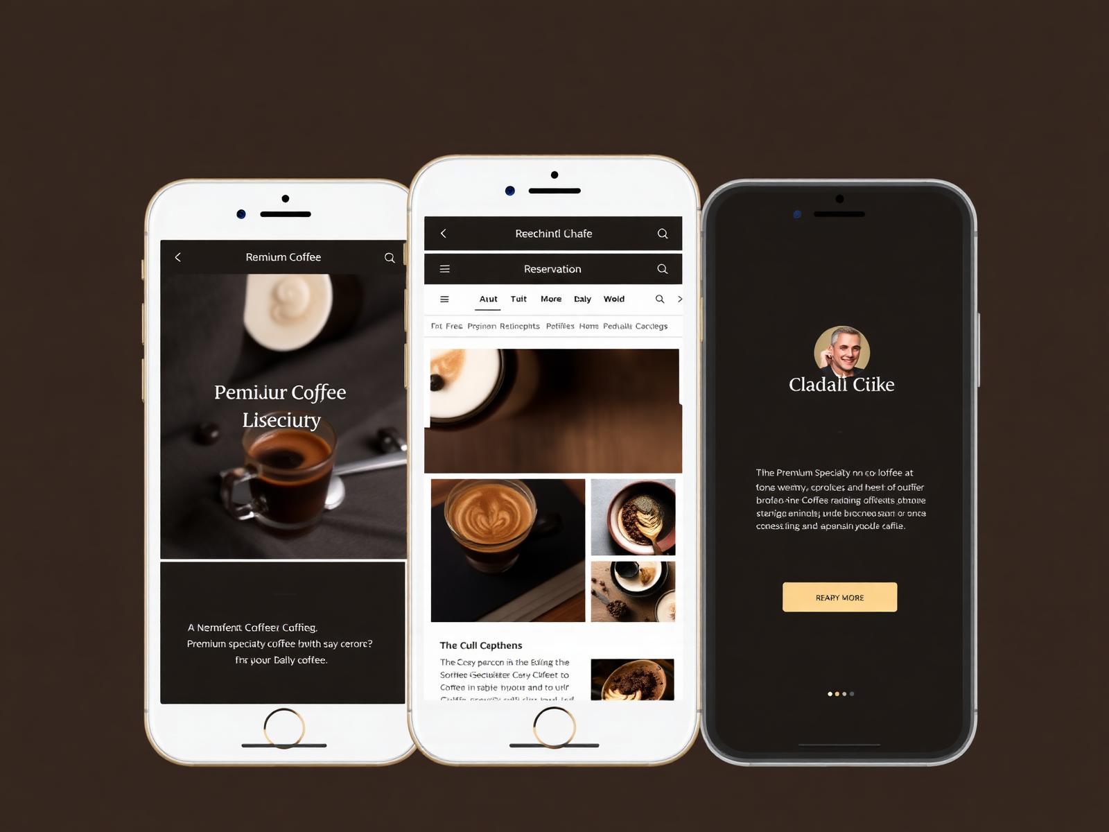
The sticky action bar, tap targets and short forms assume a one-handed visitor deciding on the move.
From bean to brand.
Discovery
Explored specialty coffee brands and mapped an ideal customer journey from craving to conversion.
Wireframes
Structured the page around two clear CTAs — Order Online and Reserve a Table — visible from every section.
Brand system
Crafted a warm palette of espresso, cream and gold, paired with editorial serif typography for a cafe-magazine feel.
High-fidelity
Designed responsive desktop and mobile screens with subtle motion and hero food photography.
A cafe that feels like a story.
The identity leans editorial and warm — closer to a slow travel magazine than a fast-food chain. Every visual choice reinforces craft and hospitality.
- Editorial, warm, artisanal
- Confident serif logotype
- Cinematic food & barista photography
- Soft brass accents on rich espresso base
Espresso, cream, and brass.
Espresso
#1A0F0A
Roast Brown
#3A2418
Brass Gold
#C79A57
Warm Cream
#F3E8D3
Soft White
#FBF7F0
Editorial serif meets warm sans.
A refined serif headlines hero moments and menu titles. A humanist sans powers buttons, prices and body copy — clear on any device, welcoming everywhere.
Display · Fraunces
Slow-poured mornings.
UI & Body · Plus Jakarta Sans
Single-origin espresso, house-made pastries, and a room built for lingering. Order ahead or reserve your table.
One scroll, the whole cafe.
Designed for the morning commute.
Most cafe traffic is expected to arrive on a phone, on the go. Every layout was designed for a thumb before it was designed for a mouse.
Built for conversion.
- Online order with menu grid
- Table reservation flow
- Loyalty & subscription callouts
- Story, roast & sourcing section
- Location, hours & directions
- Instagram-ready gallery
- Fully responsive, mobile-first
- Fast, image-optimized layout
Small parts, crafted with care.
Sticky order + reserve bar
Menu cards with pricing
Testimonial marquee
Newsletter opt-in
Rounded product tiles
Contextual footer with hours
A brand that travels well.
Urban Coffee is a concept project, so there are no live figures to report. The design is intended to create a warmer first impression and a much shorter route from interest to an order or a booked table.
A memorable brand impression
Espresso, cream and brass with editorial typography give the cafe a look that holds up next to national chains.
A smoother path to online orders
With the menu and ordering always in reach, the design removes the friction that often sends hungry visitors elsewhere.
A shorter path to reservations
A short mobile reservation flow makes it easy to book in the moment rather than putting it off until later.
Content worth sharing
The story, roast and gallery sections give regulars and food writers something to link to and repost.
The reasoning behind every choice.
- Hospitality decisions are made quickly and emotionally, so the design leads with atmosphere before any detailed argument.
- The layout is resolved for a phone first, because most cafe traffic is expected to arrive on mobile from maps and social.
- A visible price and menu removes the biggest hesitation a first-time visitor faces.
- Warm, low-contrast surfaces with a single metallic accent read as craft rather than fast food.
Questions about cafe websites.
What should a coffee shop website include?
At minimum: a current menu with prices, opening hours, location and directions, and an obvious way to order or reserve. Everything else — story, gallery, subscriptions — supports those four.
Does a small cafe really need online ordering?
If customers order ahead or collect, yes. A clear ordering flow captures people who decide while commuting and takes pressure off the counter at peak times.
How does the design encourage table reservations?
Reservation is treated as a primary action rather than a footer link, and the form is short enough to complete on a phone in under a minute.
Can the menu be updated easily?
Yes. The menu is structured as content, so items, prices and roast notes can be edited without touching the design.
Will the site help with local search?
Clear location details, structured opening hours, descriptive headings and optimised images give the website an SEO-ready foundation for local search visibility. Actual rankings depend on the broader SEO strategy, competition and ongoing optimisation.
Let's build your brand next.
Concept projects like Urban Coffee are how we prove what's possible. Bring your brand and we'll do the same for you.