
FitForge.
A premium gym website design concept for a modern fitness brand — a custom fitness landing page built to sell memberships, present training programs clearly and create a strong, motivating brand experience.
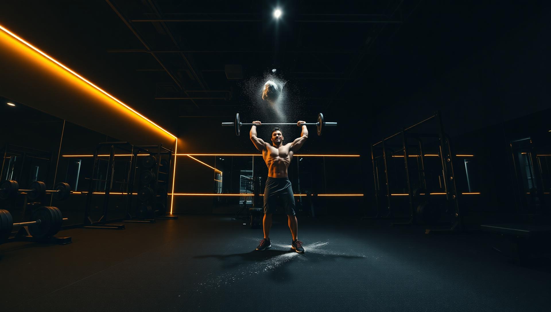
Forged for performance.
FitForge needed a landing page that felt like walking into the gym itself — dark, bold, and unmistakably premium. The concept turns a single scroll into a full brand experience that converts visitors into members.
- Brand
- FitForge (concept)
- Industry
- Fitness
- Type
- Concept Project
- Services
- Web Design · UI/UX · Responsive · Landing Page
- Deliverables
- Full landing page concept
More members, stronger brand.
- Increase gym memberships from the landing page
- Showcase premium training programs & classes
- Highlight expert trainers and their credentials
- Create a strong, motivating brand experience
Look premium without looking intimidating.
Most gym sites either scream discount chain or feel exclusive to the point of scaring away newcomers. This concept aims for both — elite finish, welcoming tone.
Every section is built to earn confidence: coach profiles, transparent pricing, schedules that fit real lives, and a booking flow that never asks twice.
One page, one commitment.
A single, high-contrast landing page organized around one primary action: book a free week. Everything above the fold answers "why this gym", everything below removes friction.
Gold is used sparingly — only on CTAs, prices and highlights — so the eye always knows where to go next.
Momentum from the first scroll.
Gym sign-ups are impulse decisions with a short window. The UX approach was to build energy quickly, answer the three questions every prospective member has — what does it cost, when can I train, who trains me — and then make joining or booking a trial the easiest thing on the page.
Answer price early
Membership tiers sit high in the journey with the differences spelled out, so nobody has to hunt for cost before they can commit.
Make the timetable usable
The class schedule is laid out as a scannable grid rather than an image, so a visitor can check a Tuesday evening in seconds.
Put the coaches forward
Trainer profiles and member stories carry the credibility that stock gym photography cannot.
One conversion, repeated
Start a trial is the single primary action, echoed after every persuasive section rather than competing with it.
From strategy to a polished concept.
Discovery
Explored high-performance gym brands and mapped an ideal journey from curiosity to a 7-day trial.
Wireframes
Structured the page around one goal — get the visitor to start a trial or book an intro session.
Brand system
Built a bold black & gold identity with editorial typography that reads confident, elite, and modern.
High-fidelity
Designed responsive desktop and mobile screens with cinematic photography and sharp micro-motion.
A brand that looks like effort.
The identity leans athletic and editorial — closer to a performance magazine than a big-box gym. Every visual choice reinforces discipline and craft.
- Bold, cinematic, high-performance
- Confident wordmark with sharp geometry
- Editorial athlete photography
- Gold accents on deep obsidian base
Obsidian, gold, and steel.
Obsidian
#0A0A0A
Onyx
#161616
Forge Gold
#D4AF37
Steel Grey
#8A8A8A
Soft White
#F5F5F5
Editorial serif meets confident sans.
A refined serif headlines hero moments and pricing. A humanist sans powers UI, schedules and body — sharp on every screen, welcoming everywhere.
Display · Fraunces
Forge your strength.
UI & Body · Plus Jakarta Sans
Elite coaching, transparent pricing, and a room built to push you further. Book your free week today.
One scroll, the whole gym.
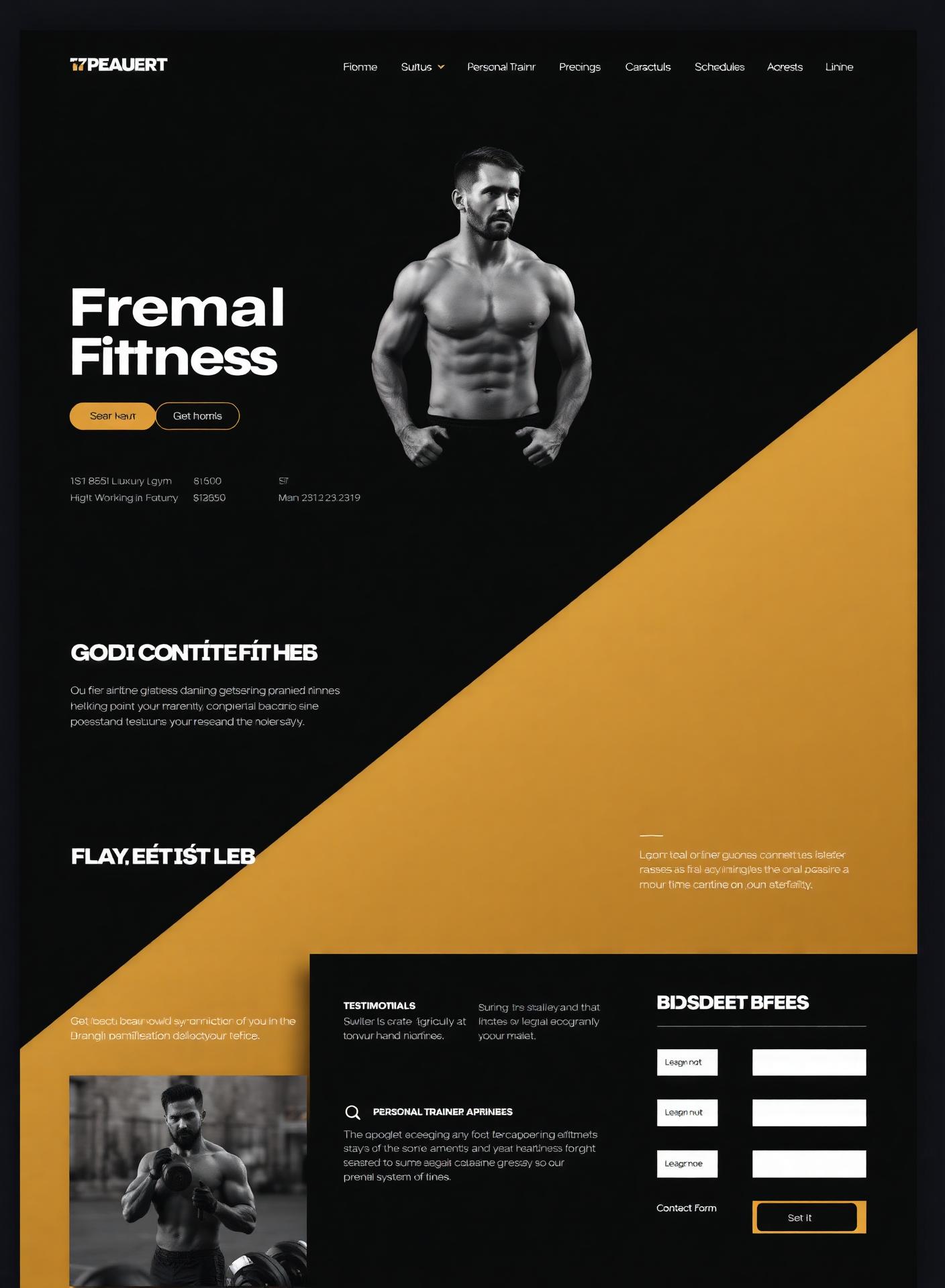
Designed mobile-first.
Members book classes and check schedules on their phone. Every layout was designed for a thumb before it was designed for a mouse.
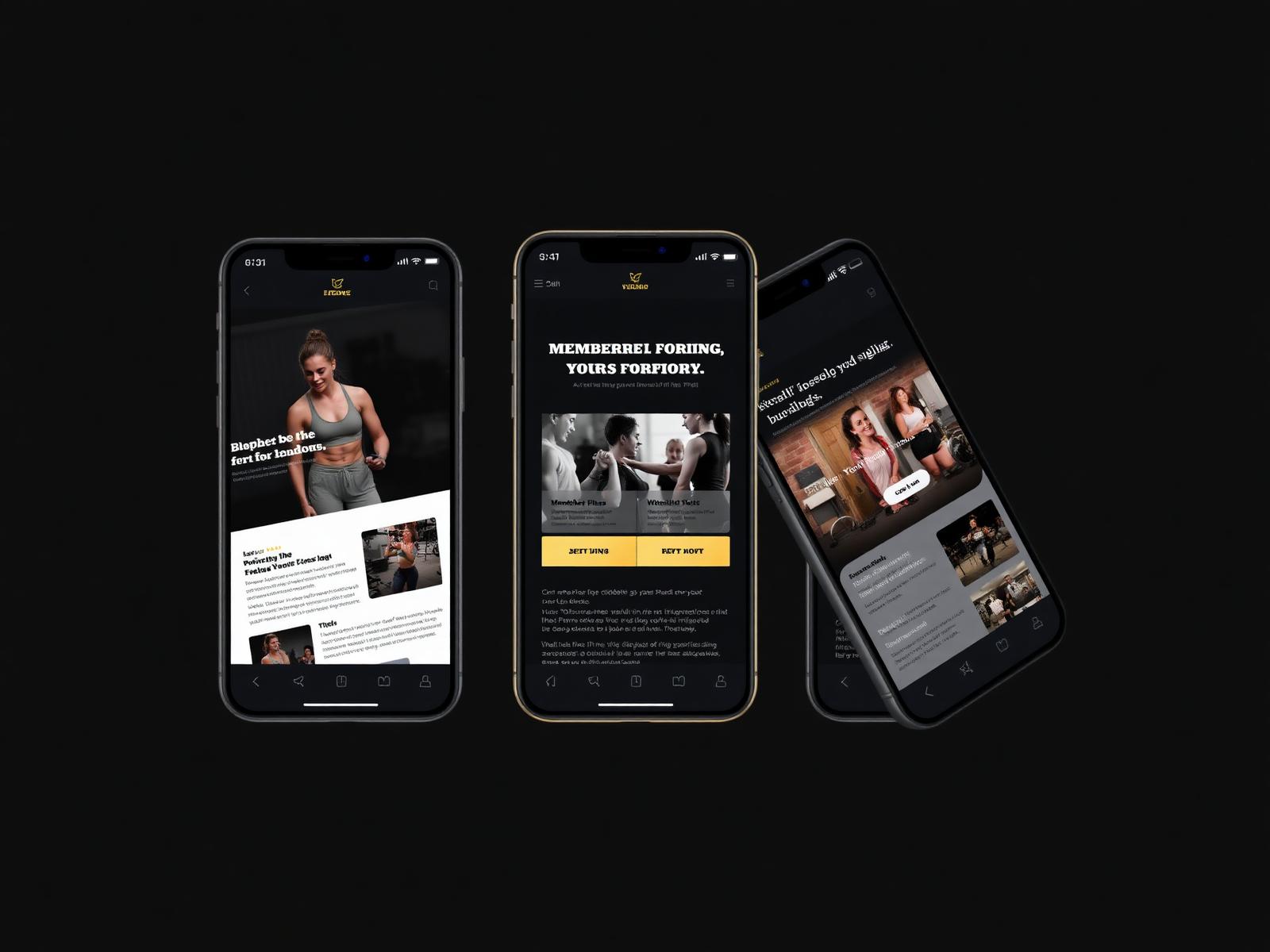
Built for conversion.
- Hero with clear membership CTA
- Membership pricing tiers
- Personal trainer profiles
- Class schedule & booking
- Testimonial marquee
- Sticky contact form
- Fully responsive, mobile-first
- Fast, image-optimized layout
Transparent pricing.
Example pricing created for this design concept.
Starter
€39/ month
- Gym access 6–22h
- Locker & showers
- Free intro session
Performance
€79/ month
- 24/7 gym access
- All group classes
- 1 personal training session
- Recovery & sauna
Elite
€149/ month
- 24/7 gym access
- All group classes
- 4 personal training sessions
- Nutrition coaching
- Guest passes
Meet the coaches.
Sample profiles created for this design concept.
Marko Novak
Head Coach · Strength
Sample strength coaching profile focused on powerlifting, progressive training and hypertrophy.
Ana Rakić
Conditioning Coach
Sample conditioning coaching profile focused on metabolic conditioning, mobility and athletic performance.
Luka Perić
Personal Trainer
Sample personal training profile focused on body composition, custom programming and sustainable training.
Weekly line-up.
- Mon07:00Strength Foundations
- Tue18:30HIIT & Conditioning
- Wed19:00Olympic Lifting
- Thu07:00Mobility & Recovery
- Fri18:30Metcon Friday
- Sat10:00Open Gym + Coaching
Sample Member Stories.
Example testimonial content created for this design concept.
"Example testimonial showing how member stories could communicate the coaching experience on a real gym website."
"Example testimonial illustrating how clear programming and pricing information could reassure a prospective member."
"Example testimonial demonstrating how a simple trial sign-up could encourage a first visit to the gym."
Book your free week.
A short, single-column form — name, email, goal. Nothing else stands between the visitor and their first session.
Small parts, crafted with care.
Sticky top nav with CTA
Pricing tiles with featured plan
Trainer cards with hover reveal
Class schedule table
Testimonial slider
Contact & trial form
Built to convert first-time visitors.
FitForge is a concept project, so there are no live membership numbers to report. The design's contribution is a clearer offer, faster answers and a trial sign-up that is hard to miss.
Fewer unanswered objections
Pricing, schedule and trainer credentials are all resolved on the page, so fewer prospects leave to research elsewhere.
A stronger, more distinct brand
The bold, high-contrast identity separates the gym from the interchangeable look of most fitness sites.
More trial enquiries
A repeated, unambiguous call to action gives motivated visitors an obvious next step at any point in the scroll.
Better retention of mobile visitors
Fast, image-optimised layouts and thumb-friendly controls keep people moving through the page on a phone.
The reasoning behind every choice.
- Fitness intent decays fast, so the page removes research steps instead of adding persuasion.
- Transparent pricing builds more trust than a Contact us for pricing gate, and filters enquiries to serious prospects.
- Trainer profiles and sample member stories demonstrate how authentic social proof could strengthen credibility on a real fitness website.
- High contrast and strong type match the emotional register of training, so the design feels like the product it sells.
Questions about gym websites.
What should a gym website do first?
Answer cost, timetable and location without friction. Most visitors arrive with those three questions and leave when the site makes them hunt.
Should membership prices be published online?
In almost every case, yes. Published pricing sets expectations, reduces time-wasting enquiries and signals confidence in the offer.
How does the site encourage trial sign-ups?
Starting a trial is the only primary action, and it reappears after each section that builds motivation — pricing, trainers and member stories.
Can class schedules and plans be changed later?
Yes. Schedules, plans and trainer profiles are structured content, so they can be updated without redesigning the page.
Does the design work for a small independent gym?
It does. The same structure works whether you run one studio or several; the tiers, timetable and coach profiles simply reflect your own offer.
Ready to Build a Website That Performs?
Let's create a modern website that helps your business attract more customers and grow online.