
Elite Dental.
A premium dental website design concept for a modern private clinic. Built to earn trust at first glance, make appointment booking effortless, and position the practice as the clear choice for patients researching their care.
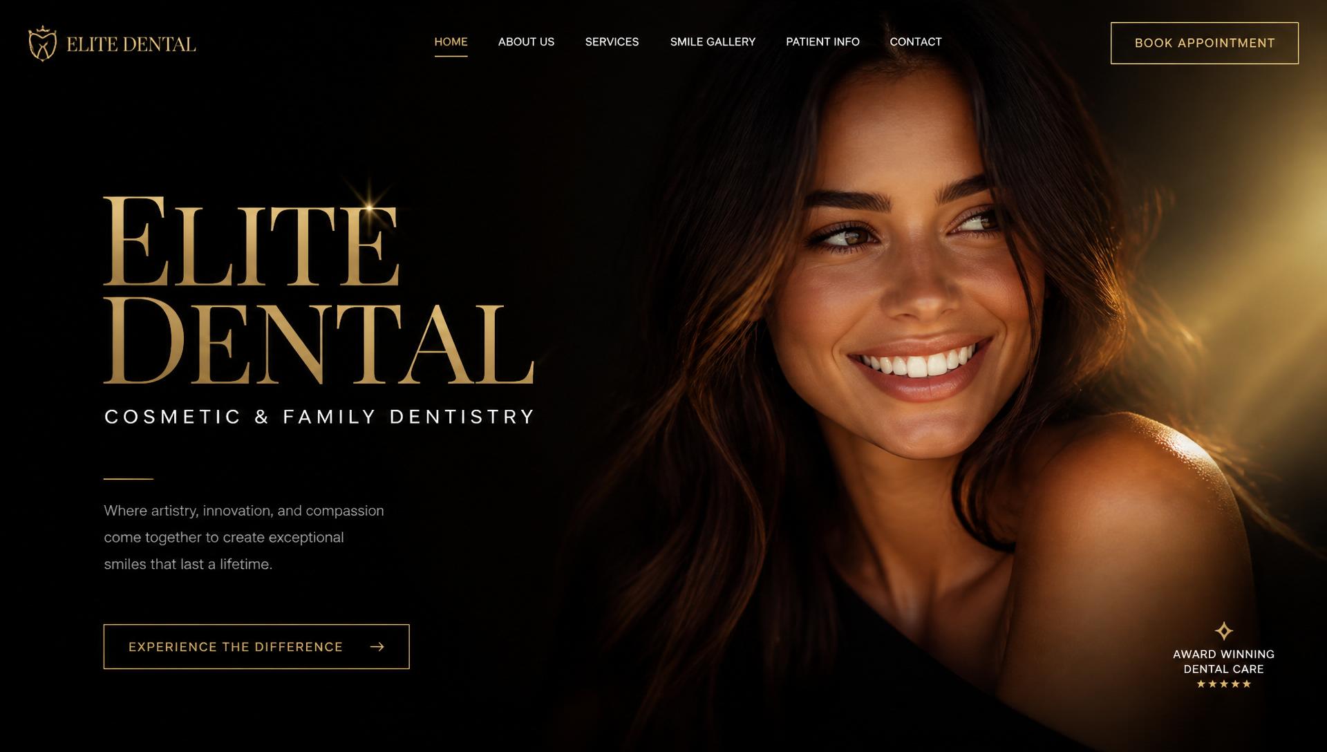
A website as refined as the care inside.
Elite Dental represents a modern private dental practice offering general, cosmetic and implant dentistry. The project explores how a premium dental clinic website can feel calm, confident and unmistakably professional — a digital space that reflects the quality of care patients receive in person.
The purpose was to design a custom website that answers a patient's most important questions before they ever pick up the phone: who treats me, what treatments are available, and how do I book? The objective was a healthcare website design that builds trust quickly, presents treatments clearly, and turns interest into an appointment request with minimal friction.
- Client
- Elite Dental
- Industry
- Healthcare
- Type
- Design Concept
- Services
- Web Design · UI/UX · Responsive · SEO Ready
- Deliverables
- Full website concept
Design goals for a modern dental clinic website.
Most dental clinic websites face a common set of design challenges. Patients arrive anxious, compare options quickly, and decide within seconds whether a practice feels trustworthy enough to contact.
This concept was designed to solve those challenges directly: build trust before asking for a booking, make appointment scheduling feel simple and low-pressure, present treatments in plain language without overwhelming detail, create a premium first impression that separates the practice from template-built competitors, improve mobile usability for patients searching on their phones, and lay the groundwork for local SEO so the clinic can be found by patients nearby.
A structured process for premium results.
Every Horex project follows a clear design process. For this dental website design, the focus was on understanding the patient's mindset first, then shaping an interface that guides them calmly from first impression to appointment request.
Research
Outlined the research considerations for this concept: the typical questions patients ask before choosing a dentist, the trust signals that reduce hesitation, and the common patterns in competitor dental sites this design set out to improve.
Wireframing
Mapped every page around one rule: the path to an appointment request should be obvious, short and never more than a tap away.
UX Planning
Structured the patient journey from reassurance to action, prioritising trust signals, treatment clarity and low-friction conversion.
Visual Design
Developed a black and gold identity with an editorial serif and humanist sans pairing that feels premium without being cold.
Responsive Optimisation
Resolved every layout for mobile first, then scaled up to tablet and desktop so the booking flow stays effortless on any device.
Performance Optimisation
Compressed images, refined asset loading and kept the codebase lean so pages load fast even on slower mobile connections.
SEO-ready Structure
Built dedicated treatment pages, clean heading hierarchies, metadata and structured data to support local dental searches.
A calm interface for an anxious decision.
Choosing a dentist is a trust decision before it is a price decision. Our dental website design approach answers the patient's unspoken questions in order — who treats me, what happens, how do I book — through a deliberate visual hierarchy, an editorial serif and humanist sans pairing, a restrained black, gold and cream palette, and a responsive layout system that keeps the booking action in reach on every screen size.
Trust before persuasion
Team profiles, credentials and plain-language treatment explanations appear early, so patients feel informed and reassured rather than sold to.
A deliberate visual hierarchy
Every screen leads the patient through one decision at a time — reassurance first, detail second, booking last — so nothing competes for attention.
Typography that signals expertise
An editorial serif carries headlines while a warm humanist sans handles body copy and forms, giving the practice authority without feeling cold or clinical.
Colour used with restraint
Obsidian black, champagne gold and warm cream keep the palette calm, so gold can be reserved almost entirely for the actions that matter most.
Conversion-focused by default
Booking an appointment is never more than a tap away. Short forms and a single primary action remove the friction that causes patients to drop off.
Responsive from the smallest screen up
Layouts were resolved for a phone first, then scaled to tablet and desktop, so the experience stays effortless wherever the patient finds the clinic.
Editorial serif meets clean sans.
A refined serif carries hero moments and section titles, while a warm, humanist sans handles UI, body, and forms. The pairing signals expertise without ever feeling cold.
Display · Fraunces
A brighter smile.
UI & Body · Plus Jakarta Sans
Luxury dental care in a serene environment. Advanced technology. Exceptional results.
Black, gold, and warm cream.
Obsidian
#0B0B0B
Champagne Gold
#D4AF37
Warm Cream
#F6EFE1
Charcoal
#1A1A1A
Soft White
#FFFFFF
A homepage that books itself.
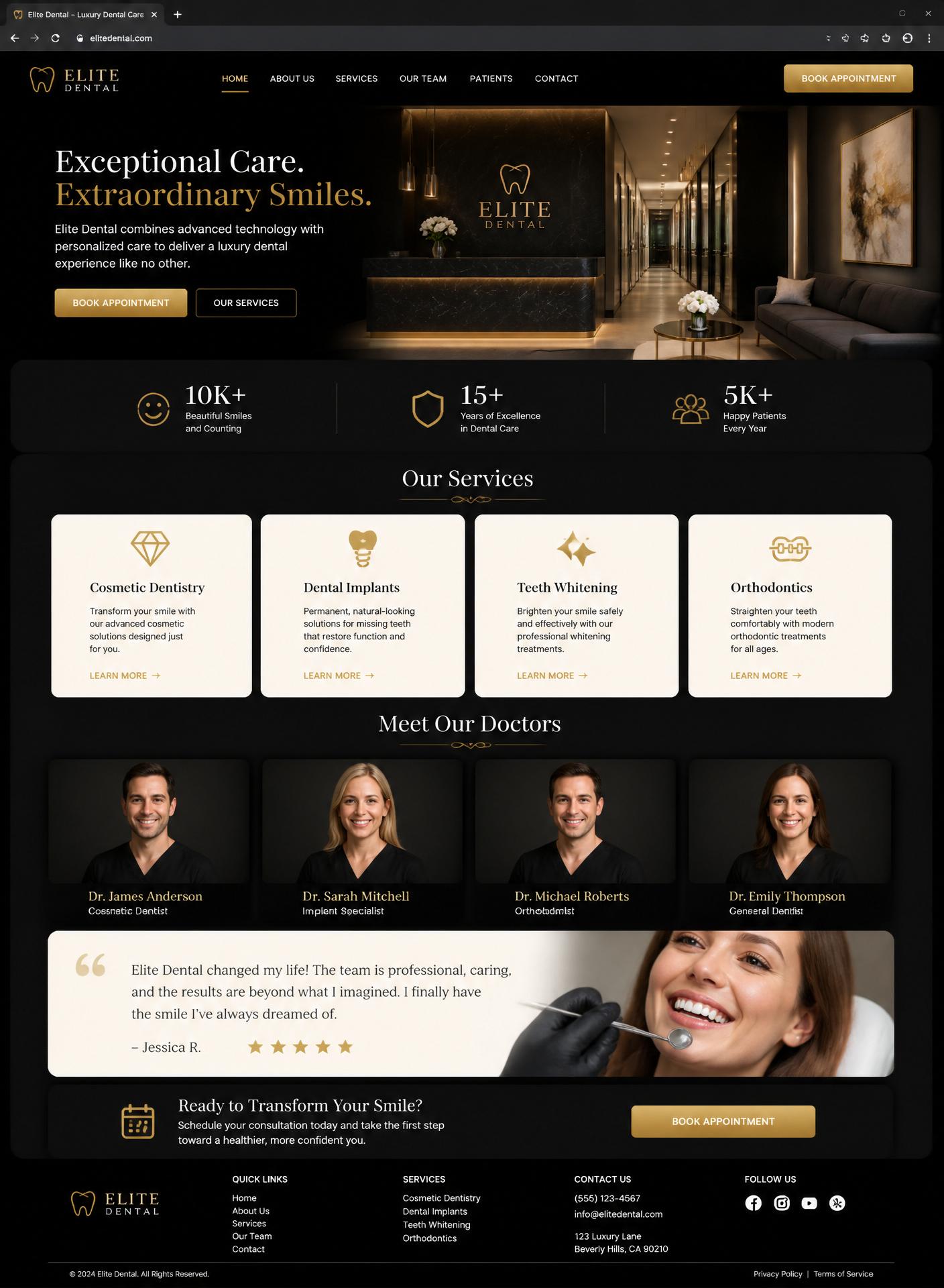
Designed mobile-first.
Most people look for a dentist on a phone, often at the moment the problem starts. Every layout was resolved for a thumb before a mouse, with tap targets, readable type and a booking button that stays reachable on the smallest screen.
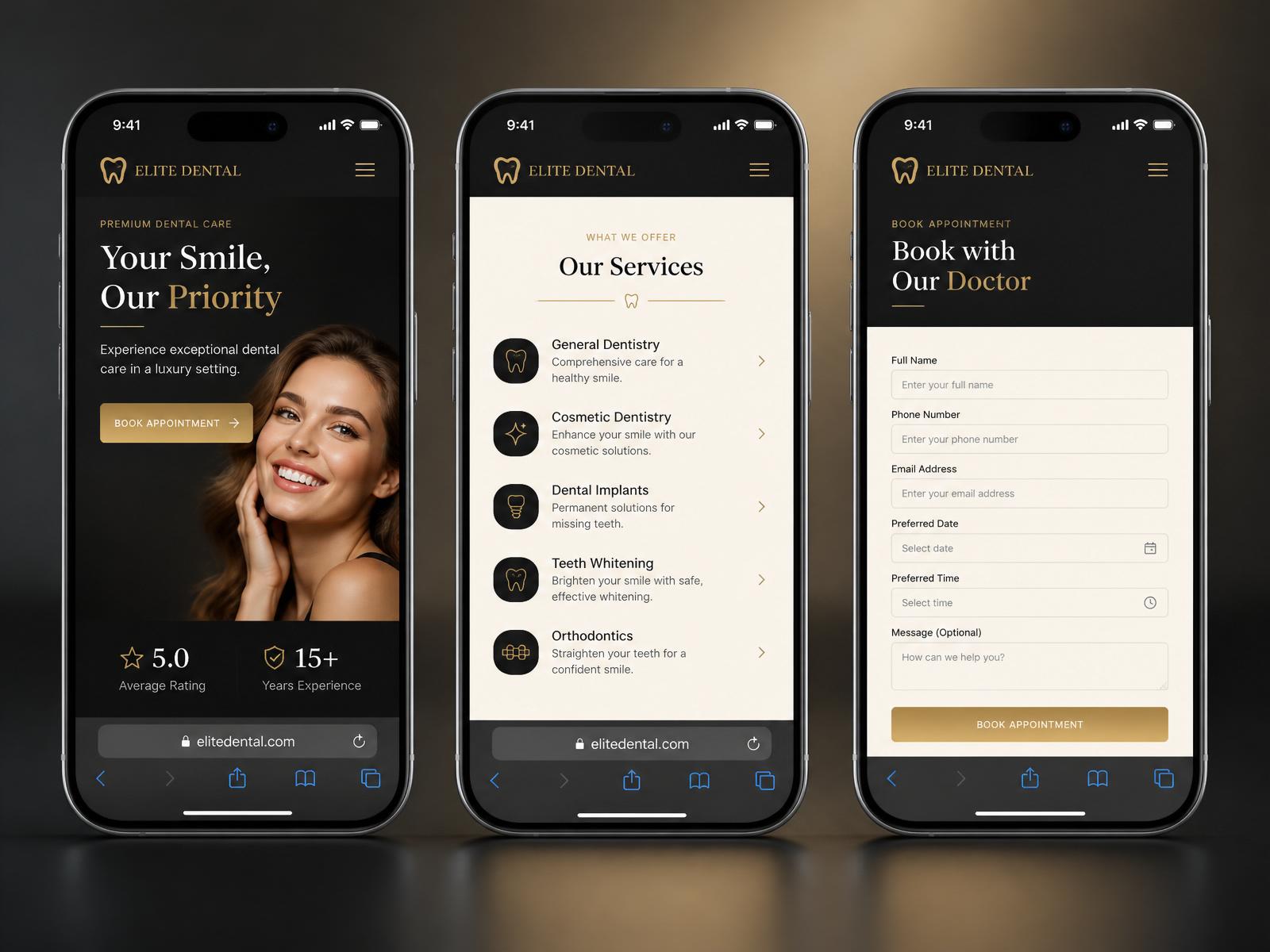
Built for trust and conversion.
- Responsive design across all devices
- Appointment-focused layout with persistent CTAs
- Fast loading, image-optimised pages
- SEO-ready structure, headings and metadata
- Clear navigation with no dead ends
- Premium black and gold visual identity
- Doctor and team profiles with credentials
- Dedicated treatment pages in plain language
- Smile gallery and testimonial-ready sections
- Accessibility-conscious contrast and tap targets
- Location, opening hours and directions up front
- Modern serif and sans typography pairing
The psychology behind every choice.
- Patients decide emotionally and justify rationally. The design leads with reassurance and human warmth, so a nervous visitor feels safe before reading a single treatment detail.
- Showing real clinicians, credentials and plain-language explanations answers the question every anxious patient is really asking: can I trust these people with my health?
- Dental searches are dominated by mobile. Every layout is resolved for a thumb before a cursor, because a booking button a patient cannot reach is a booking that never happens.
- A single, repeated call to action outperforms several competing ones. Requesting an appointment is the only primary action, so patients never have to guess what to do next.
- Restraint reads as expertise. Fewer colours, fewer fonts and slower pacing signal a practice confident in its work, and premium web design often justifies a premium fee in the patient's mind.
- A clean, well-structured site is also a findable one. The same clarity that helps patients understand the practice helps search engines understand what the clinic offers.
What this design sets up.
Elite Dental is a concept project, so we do not quote percentages or revenue figures we have not measured. What the design reliably sets up is a stronger, more credible online presence, an easier route to booking an appointment and a smoother experience on every device.
Improved credibility
Visible clinicians, clear treatment information and a considered visual identity help the practice feel established, professional and safe to choose.
Better first impressions
A premium dental website design creates an immediate sense of quality, helping the practice stand apart from template-built competitors in the same area.
Easier appointment enquiries
With booking present on every page and forms kept short, interested patients can request an appointment without hunting for the right button or link.
Stronger online presence
A distinct, well-structured site gives the practice a professional home that looks and reads better than the generic sites competing for the same local searches.
Improved mobile experience
Fast pages, clear navigation and mobile-first layouts mean patients can find answers and take action quickly, on whatever device they happen to be using.
A foundation for local search
Dedicated treatment pages and clean semantic structure give the clinic something worth ranking for in local dental searches from day one.
Questions about dental website design.
How long does a dental website take to design and build?
A custom dental website of this scope typically takes between four and eight weeks from initial strategy to launch. The timeline depends on how quickly content, photography and team information are supplied. Multi-location clinics or advanced booking integrations may take a little longer.
Can patients request appointments online?
Yes. The appointment request is the primary action across every page. Short enquiry forms, persistent call-to-action buttons and clear treatment pages make it easy for patients to take the next step, either directly or through your existing practice management software.
Is the website mobile friendly?
It is designed mobile-first. Most people search for a dentist on their phone, often when a problem first arises. Layouts, tap targets and the booking flow are resolved for a thumb before a cursor, then scaled cleanly to tablet and desktop.
Can the website be expanded as the practice grows?
Absolutely. The structure is built to grow with the practice. New treatments, locations, team members and content pages can be added without rebuilding the site, so the investment continues to deliver value over time.
Is SEO included in the design?
The website is built with an SEO-ready foundation, including clear heading structure, metadata, semantic content, optimised images and structured data. Ongoing SEO strategy and campaigns can be added separately when needed.
Ready to create a website your patients will trust?
Let's design a website that reflects the quality of your practice and helps turn visitors into new enquiries. Bring us your goals, and we'll build a premium site that earns confidence from the very first click.